6 Inequality
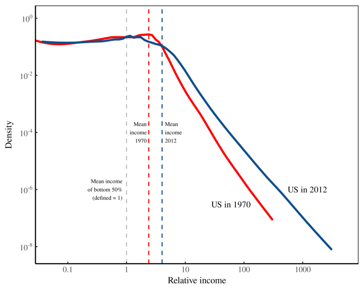
Figure: How the US distribution of income has changed since 1970. Probability density of US income in 1970 and 2012. Normalized incomes so that the average income of the bottom half of Americans equals 1. Note the log scales on both axes. Source Blair Fix
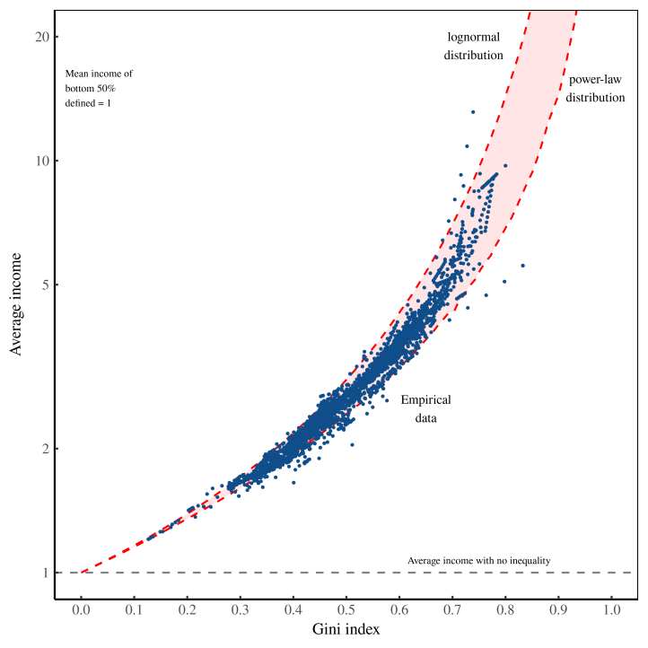
Figure: Modeling radically progressive degrowth. The horizontal axis shows income inequality (within countries), measured using the Gini index. Blue points are empirical data. The vertical axis shows average income (in a country), defined so that the mean income of the bottom-half of earners equals 1. The dashed red lines show the trend produced by ramping up inequality in a lognormal distribution (left) and power-law distribution (right). Source Blair Fix
- Abstract Blair Fix:*
What explains the power-law distribution of top incomes? This paper tests the hypothesis that it is firm hierarchy that creates the power-law income distribution tail. Using the available case-study evidence on firm hierarchy, I create the first large-scale simulation of the hierarchical structure of the US private sector. Although not tuned to do so, this model reproduces the power-law scaling of top US incomes. I show that this is purely an effect of firm hierarchy. This raises the possibility that the ubiquity of power-law income distribution tails is due to the ubiquity of hierarchical organization in human societies.
Blair Fix (2018) Hierarchy Power Law Income Distribution (pdf)