36 Inequality
Wright
Stop talking about inequality, start talking about exploitation.
Ian Wright (2017) The Social Architecture of Capitalism
36.1 US and UK are poor countries with rich people within
Murdoch
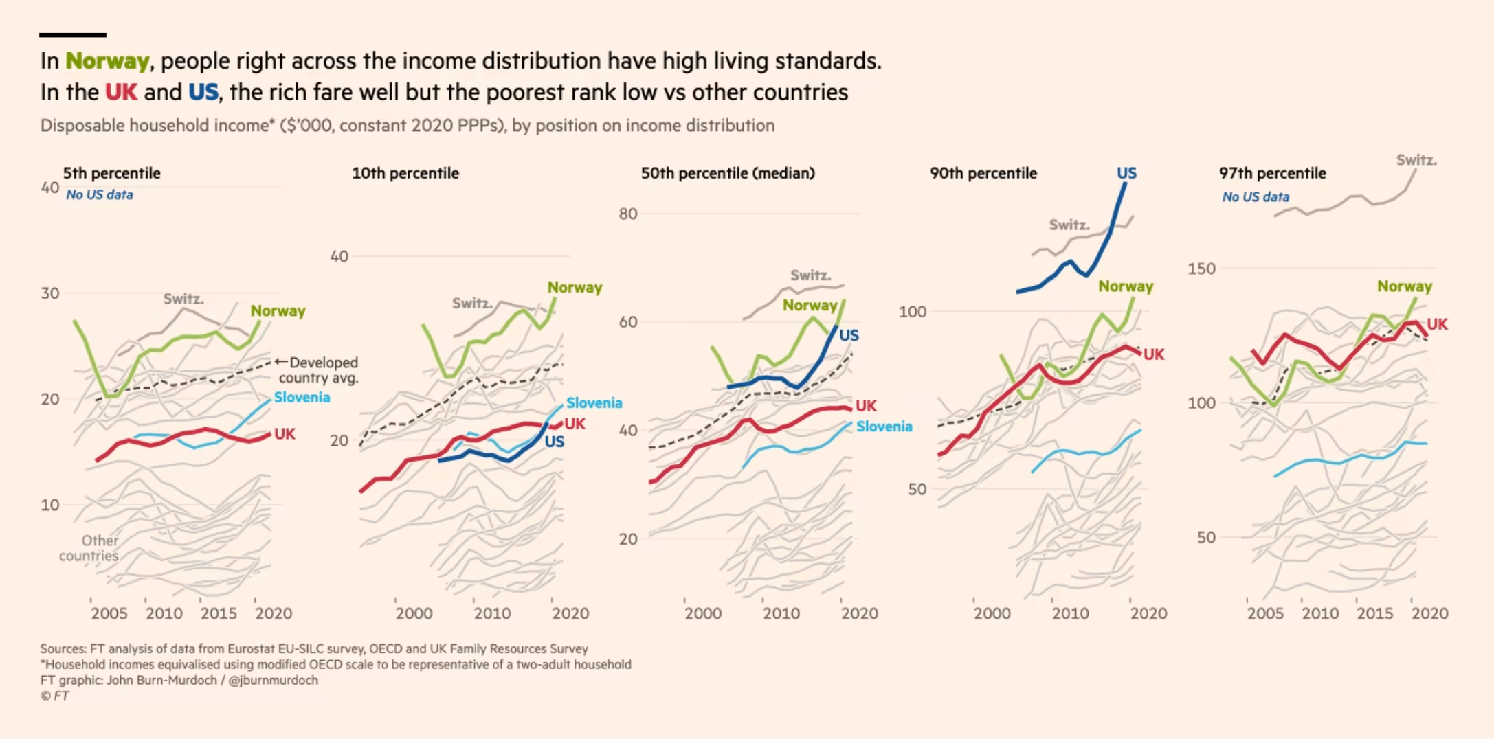
On comparison of income levels adjusting for inequality UK & USA emerge as “poor societies” with rich people in them.
(jburnmurdoch?) (2022) FT (paywall)
Smith
By focusing only on the rich and the poor, Murdoch leaves out something incredibly important — the middle class. Of course it’s important to uplift the people at the bottom of the socioeconomic ladder. But most people are not at the bottom of the ladder. That’s true by definition. And when we look at how Americans in the middle of the distribution are doing, we see that America is not a “poor society” at all — in fact, it’s one of the richest on Earth. America’s middle class has higher living standards than almost any other country’s middle class
Noah Smith (2022) We’re a rich society with some very poor people.
36.2 Poverty
Policy Tensor
The dramatic reduction in extreme poverty hailed by the World Bank—and taken seriously by many serious people, including myself until he alerted me—just did not pass the laugh test. Specifically, researchers associated with the Bank and cognate institutions responsible for poverty alleviation have estimated that the rate of extreme poverty has declined from 25% of the world population in 2000 to around 8% by 2018.
The percentage of population earning less than a dollar a day has allegedly fallen dramatically since the neoliberal counterrevolution of the late-1970s. Another index, based of the percentage of the global population that can afford to pay for basic needs like food, clothing and shelter, allegedly shows the same collapse.
This simply does not compute. The global extreme poverty rate cannot be below 10%, simply because there are more people in extreme poverty in South Asia alone. According to statistics compiled by the Government of India, more than 30% of Indian kids are stunted, meaning that they are so malnutritioned that they’re significantly shorter than they should be (per height-for-age reference charts). Now, 30% of the Indian population is already 5.3% of the world population. They don’t have enough to eat, but they’re out of extreme poverty?
So, the World Bank’s and OECD’s numbers don’t pass the laugh test. But the laugh test is a sanity check, not a formal proof that the poverty statistics are wrong. In what follows, we’ll marshal considerably more compelling evidence that the World Bank’s numbers don’t add up. We will document a systematic bias in the extreme poverty statistics for lower middle income countries over the past few decades. This group of nations accounts for 3.3 billion people, or 42% of the world’s population—and the vast bulk of the alleged reduction in extreme poverty.
The idea for the test is very simple and intuitive: variation in poverty rates, if they are indeed kosher, should track variation in, say, life expectancy—or any other measure of general well-being of a populace. If they don’t, and do so in a persistently biased way, then something is wrong with their production process.
We proceed as follows. We obtain data on extreme poverty rates from Clio-Infra compiled by Michail Moatsos and also published by the OECD. There are two metrics: (1) percent of country’s populace making less than a dollar a day; and (2) percent of the populace unable to afford basic necessities. The time period covered is 1820-2018. We shall restrict attention to the past century, when the data is much more reliable. We obtain life expectancy data from Our World in Data, which is ultimately based on UN estimates.
We detrend the data by computing 5-year changes in life expectancy and the two poverty rates. We rotate the variables so that positive numbers are good (ie, we read a decline in poverty rates as positive and a rise as negative). This makes the results easier to interpret. Having detrended and rotated the variables, we carry out two panel regressions. In both, we stratify by World Bank income group.
The response or dependent variable in both will be one of the two extreme poverty rates; the feature or predictor will be life expectancy. We admit both time fixed-effects and income group fixed-effects. The former is especially important because we need to rig the game against our result that the recent numbers are particularly biased. We cluster errors by income group. We have 1,797 country-period observations—more than enough for our purposes. Here’s what the data looks like: (table) Here’re the results of the first regression. We find the expected gradient (b = 0.1933, p < 0.0001). (table)
Here’s the main result. We look at the mean residuals by income group and time. This is contains information on the systematic bias of the poverty statistics—if any exists. If there were no systematic bias, then the residuals would be more or less random. In particular, we should not see persistent decades-long runs of over-prediction and under-prediction by our simple model.
This is not what we find. Instead, we find that, for the critical lower middle income group, gains in life expectancy overpredict reductions in extreme poverty until 1975, when the precipitous decline in global rates is alleged to have begun in earnest (see the first two graphs in this note). Conversely, from 1975 on, and especially after the Millennium Development Goals were announced in 2000 to great fanfare, we find that gains in life expectancy systematically underpredict the alleged dramatic reductions in poverty rates. In other words, the dollar-a-day and cost-of-basic-needs poverty rates paint too rosy a picture of reductions in global poverty.
In sum, we have shown that the World Bank’s extreme poverty statistics have been implausibly rosy for the crucial group of lower middle income countries—the principal site of the alleged dramatic reduction in global poverty—precisely in the period of the alleged dramatic reduction in extreme poverty.
The chasm that has now opened up between the self-congratulatory discourse of the global development institutions and ground realities has become ridiculously large.
[Policy Tensor (2023) Here’s Proof that Extreme Poverty Statistics are Unreliable](Here’s Proof that Extreme Poverty Statistics are Unreliable](https://policytensor.substack.com/p/heres-proof-that-extreme-poverty)
36.3 Billionaire Concentration
Fix
The billionaire headcount is determined in large part by a single quantity: a country’s average income - More money, more billionaires. Compared to poor countries, rich countries ought to have more billionaires.
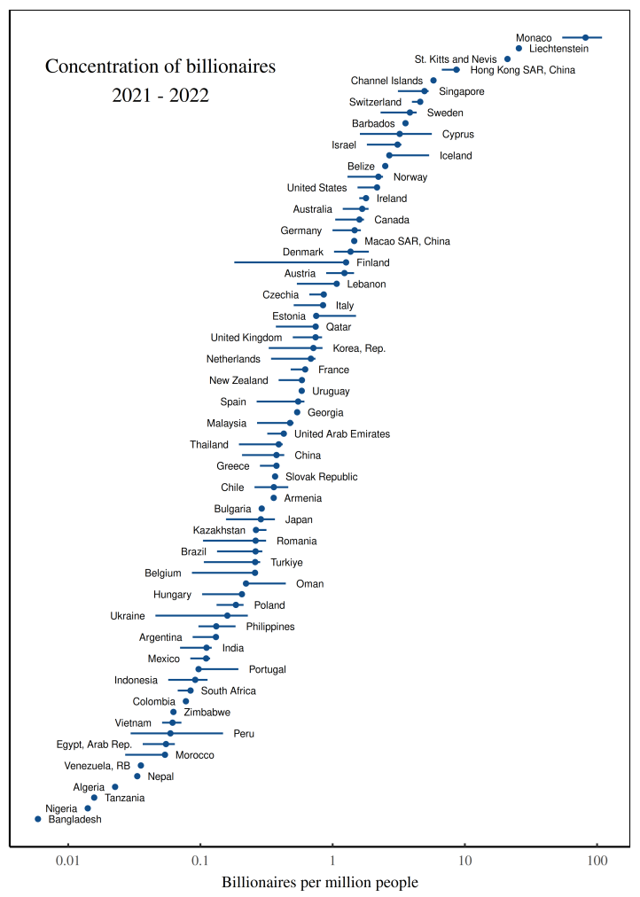
Fig: The concentration of Forbes billionaires across countries. This figure uses Forbes data to measure the concentration of billionaires among the world’s countries, circa 2021-2022. Each point indicates the average concentration of billionaires within the corresponding country. (Note that the horizontal axis uses a logarithmic scale.) To construct the billionaire concentration, I divide billionaire counts (measured daily in 2021/2022) by population (measured in 2021). Horizontal lines indicate the 95% range of variation in the billionaire concentration over the observed time interval. (Countries without error bars have only one billionaire observation.)
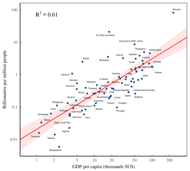
Fig: As countries get richer, they accumulate billionaires. The horizontal axis shows countries’ average income in 2021, measured using GDP per capita. The vertical axis plots the number of Forbes billionaires per capita (measured in 2021–2022).
Technically, GDP per capita measures a country’s average income (a flow), while the Forbes list measures billionaires’ wealth (a stock). For the über rich, income and wealth are two sides of the same coin.
The capitalization ritual is based on two quantities that are undetermined. Future earnings are, by definition, unknown. And the choice of discount rate is a matter of taste. So we’re left where we started — with a capitalized value that is undefined.
Not to worry. Capitalists solve the problem with customs. They agree to judge future income by looking at recent quarterly earnings. And they choose a discount rate by looking at what everyone else is doing. As a result of this herd behavior, ‘income’ and ‘wealth’ become (statistically) interchangeable.
Billionaire headcount tends to increase with a country’s per capita income because income is what gets capitalized into wealth.
When statistical agencies measure GDP, they capture (among other things) the annual profits of all the companies that reside in the given country. Investors, in turn, take these profits and capitalize them into market value. Finally, Forbes looks at this market value to judge the net worth of the billionaires on its list. The result is a closed loop between aggregate income and billionaire wealth. So as average income grows, countries accumulate more billionaires.
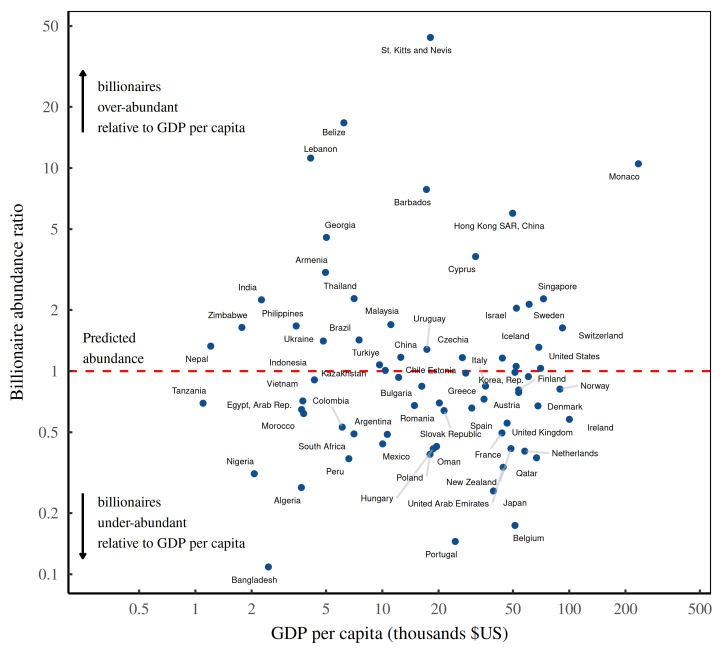
Fig: The billionaire abundance ratio. The billionaire abundance ratio divides the actual billionaire density (based on Forbes data) by the expected billionaire density based on a country’s income per capita.
Now in capitalism, we no longer have feudal despots. But there’s still plenty of hierarchy. (In fact, there’s more hierarchy.) And guess who sits at the top of this hierarchy. That would be business despots … otherwise known as billionaires.
And if a society has a dearth of billionaires, you’d expect it to be more egalitarian. In short, the relative abundance of billionaires should be a canary for social inequality.
Power Law
Now in technical terms, a power-law exponent doesn’t capture ‘inequality’ so much as it quantifies the behavior of a distribution tail. At this point, I’m throwing around a lot of jargon, so let’s move down to earth by asking the following question: how many people have double your wealth?
If you’re a member of the elite, we can predict how many people have double your net worth using a single parameter which we’ll call \(alpha\). If α=3, then people with double your wealth are 2³=8 times rarer than you. And if α=2 then people with double your wealth are \(2^2 = 4\) times rarer than you. And so on. Given α, people with double your wealth are \(2^{\alpha}\) times rarer than you.
It’s an empirical fact that among the elite, the distribution of wealth tends to follow a power law. And the properties of this power law can be summarized using a parameter called α - the exponent in the following equation:
\[ p(x)∼\frac{1}{x^α}\]
Here, p(x) p(x) p(x) describes the probability of finding someone with net worth x. We call this relation a ‘power law’ because of its mathematical form — x raised to some power α.
What’s odd about power laws is that they use grade-school math to describe complex, real-world outcomes.
In the case of the US circa 2019, the power law has an exponent of α=2.3. So if you’re an American elite, someone with double your net worth is about \(2^2.3 ≈ 4.9\) times rarer than you.
What the power-law exponent does is capture the shape of the wealth-distribution tail. A higher exponent indicates a thinner tail. And a lower exponent indicates a fatter tail.